top of page
02
LG.com
UI/UX • Prototyping • 2024


00
Yeseon Kang
About • 2024


01
LG Staff Picks
UI Design • 2024


03
Global Payments
UI/UX • Prototyping • 2024


04
Inflight Entertainment
UI/UX Design • 2024


05
General Motors
CX Design • 2024


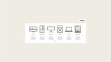
Feature 04
Shop By Appliance
The updated design improves clarity by using
real product images instead of icons, along
with better spacing and a cleaner layout.
A new hover effect adds interactivity,
creating a more engaging experience.
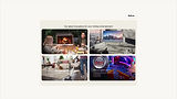
Feature 03
Product Card
The updated design improves type hierarchy
by making product names bolder and more
noticeable. The descriptions are simplified to
reduce clutter, and red accent tags like 'Best
Seller' and 'Best Deal' are added, making the
card stand out.

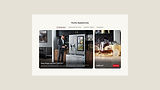
Feature 02
In-Page Banner
Redesigned this in-page banner for a cleaner,
more focused layout. The new design
highlights a specific product with better
navigation, visual hierarchy, and structured
content, making it easier for users to find and
engage with key information.
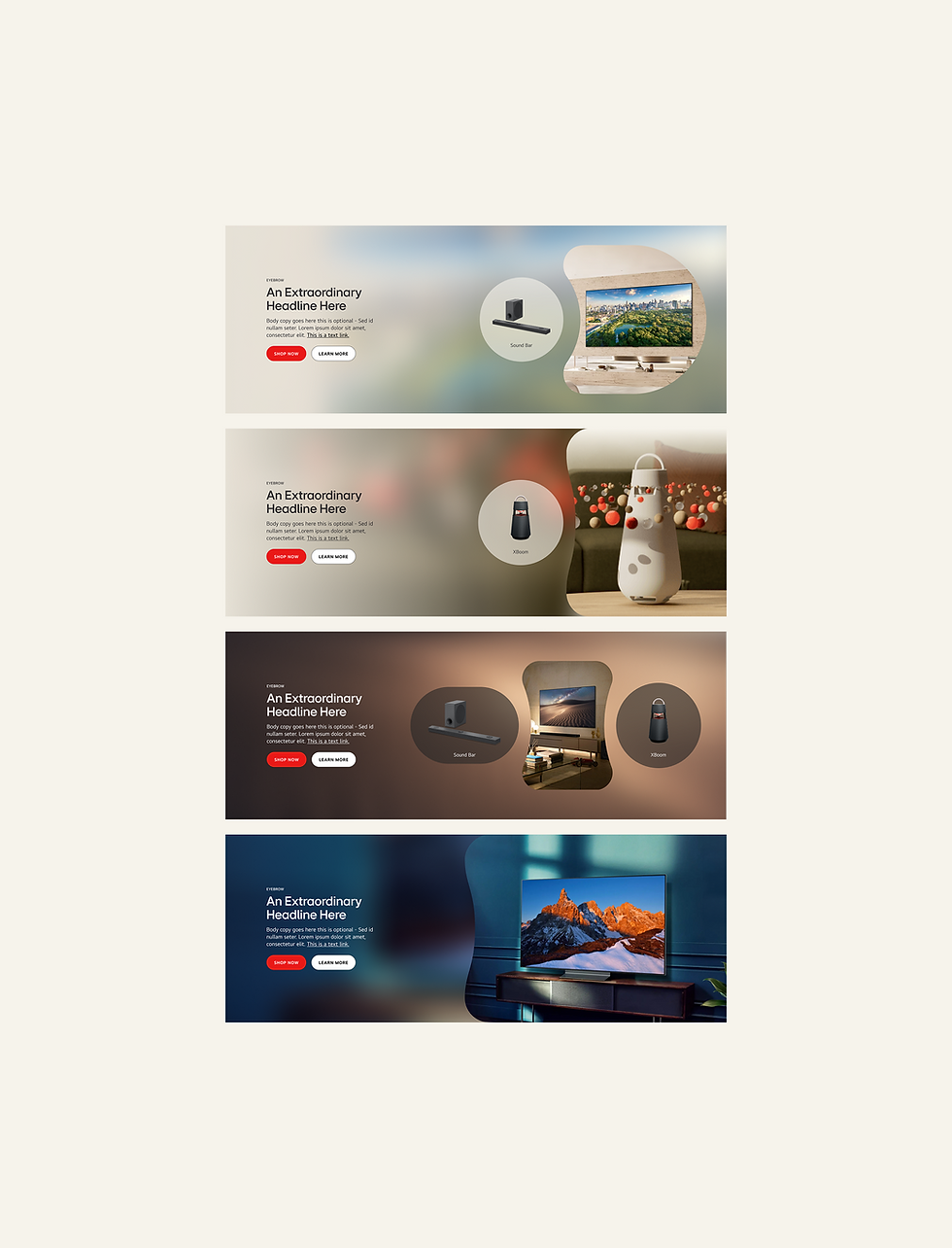
Feature 01
Hero Banners
Hero banners are designed using the
LG EI shapes, aiming to showcase the
connection between lifestyle and product.
The background features a blurred
version of the foreground image.

UI Design
UX Design
Prototyping
Overview
As a UX/UI Design Intern at HS Ad, the in-house
design agency of LG Electronics, I contributed to a
comprehensive redesign of the LG.com United States
website. The primary goal was to align the digital
experience with LG's newly updated global design
system while addressing existing UI/UX challenges.
Opportunity
This initiative focused on improving functionality,
usability, and visual consistency. Collaborating with
cross-functional teams, I addressed challenges like
grid utilization, branding consistency, and optimizing
the platform’s visual hierarchy to make product
exploration more intuitive and aesthetically pleasing.

00
Yeseon Kang
About
01
LG Staff Picks
UI Design • 2024
02
LG.com
UI/UX • Prototyping • 2024
03
Global Payments
UI/UX • Motion Graphic • 2024

04
Inflight Entertainment
UI/UX • Motion Graphic • 2024

05
General Motors
UI • Motion Graphic • 2024

bottom of page